Saltyface
Transforming a clean beauty brand into a cult favourite with a fresh and minimalist look.
Featured In:Goop, Vogue, Who What Wear, CNN, Us Weekly, Vancouver Magazine
Our Role:Brand Strategy
Brand Identity
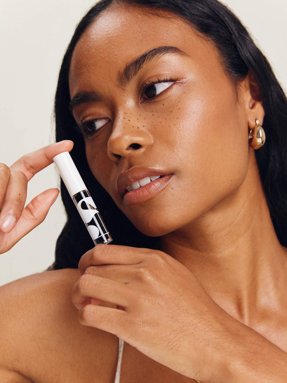
Credits:Photography: Brian Van Wyk
Production: Taylor Stuart
Makeup: Hannah Schell


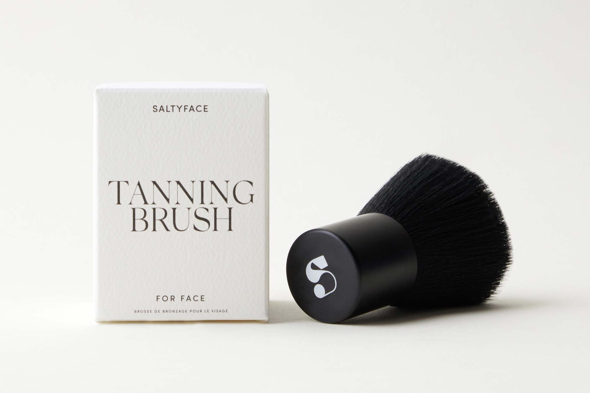
Brand Mark
Embodying that care-free, yet bold feeling in the brand mark, we landed on a stylized “S”. Drawing from the psychedelic typography of the 1960s mod era, we crafted a unique emblem that contrasts against the minimalist typeface system and wordmark.
Over four years after the rebrand, this symbol continues to stand as the most enduring and recognizable symbol of the Saltyface brand.